If my mom wanted good art on her fridge, she could’ve purchased reprints of works by Vermeer, Lichtenstein, Wyeth, etc. But she didn’t want good art – she wanted my art.
Somebody with good taste could’ve made my website, but then it wouldn’t be mine.
To bake bread, many feel compelled to grow wheat, mine salt, culture yeast, etc. Not me. My puerile palate yearns for buckets of Olive Garden breadsticks.
That’s okay. Your “mine” is not my "mine."
Some folks run self-hosted websites on solar power. Others share wisdom on Substack. This guy posts manufacturing deep-dives to YouTube. Gwern does
whatever this is.
It’s an itch – a feeling that something is really important, and you need to do something about it, and nobody else can possibly do it except you.
I am not compelled to bake bread, nor provision servers, nor build chips. Yet that itch pervades, and it pulls me toward humor and systems and life and software and structure. And when emotion becomes unbearable, it erupts out of me: fiction, HTML/CSS, crappy robots, sad songs, and so on.
My website is my website.
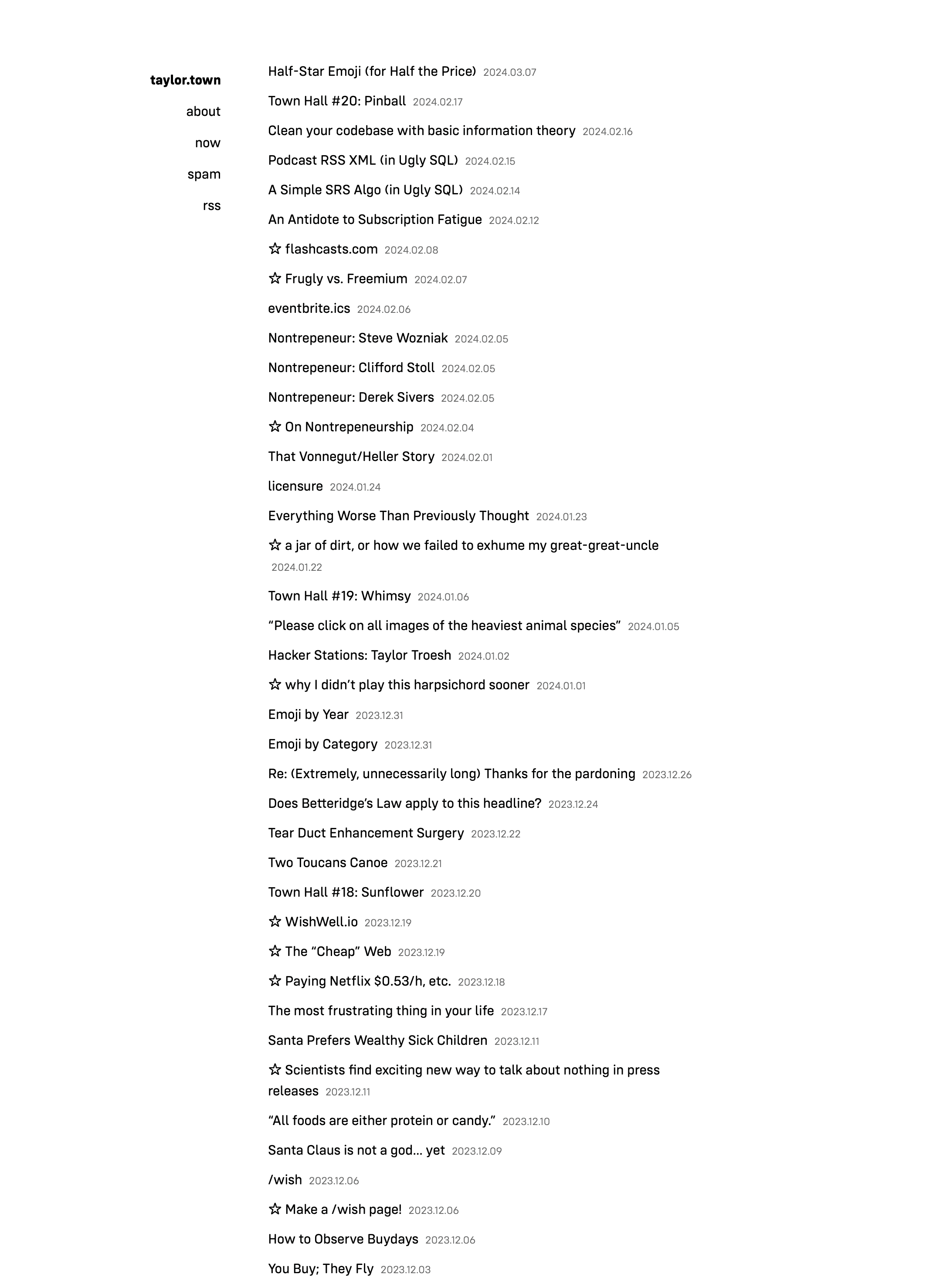
In the past, I just wanted simplicity and friendliness: remove noise, boost contrast, flatten menu depth, boring HTML, reduce CSS, avoid JS, etc.
My website looked like this:
But things started going sour when I decided to occupy as much horizontal space as possible.
The plan was simple: slap flex-wrap on a ul. Unfortunately, text wraps too. It was unclear where one link ended and the other began. Some folks read inline and others perceive inline-block.
More whitespace? Yikes. Borders around each link? No way. Dots between the links? Yuck.
So, let’s vary the links! The chaos you see on my homepage comes from a few simple rules:
li:nth-child(4n + 0) { transform: rotate(1deg); }
li:nth-child(4n + 1) { transform: rotate(-0.6deg); }
li:nth-child(4n + 2) { transform: rotate(0.5deg); }
li:nth-child(4n + 3) { transform: rotate(-0.75deg); }
li:nth-child(6n + 0) { font-family: Times; }
li:nth-child(6n + 1) { font-family: Helvetica; }
li:nth-child(6n + 2) { font-family: Georgia; }
li:nth-child(6n + 3) { font-family: Times; }
li:nth-child(6n + 4) { font-family: Arial; }
li:nth-child(6n + 5) { font-family: "Trebuchet MS"; }
I originally chose coprime integers for more variation, but I rather liked the subtle repetition in this pattern.
I love minimalism and hate sterility. I sprinkled three additional surprises to evoke a “used bookstore” feeling:
li:nth-child(5n + 2) { font-weight: 100; }
li:nth-child(7n + 2) { letter-spacing: -1px; }
li:nth-child(41n + 31) { transform: rotate(181deg); }
The web remains an interactive medium. I wanted my site to react to cursor movement without JS; this CSS produced a pleasant “touching grass” feeling:
li:nth-child(2n + 0):hover { transform: rotate(-2deg); }
li:nth-child(2n + 1):hover { transform: rotate(2deg); }
Okay, now it reacts to cursor movements, but I also wanted to exaggerate that scrolling feeling without scrolljacking. Simple textured backgrounds make a webpage feel more like a page. So I synthesized texture with css-doodle:
svg {
viewBox: .5 .5 10 10;
fill: #000;
circle*1000 {
  cx, cy: @r(10), @r(10);
  r: @r(.005, .01);
  }
}
So many little dots. In light mode, they become dust on paper. In dark mode, they’re stars in the sky.
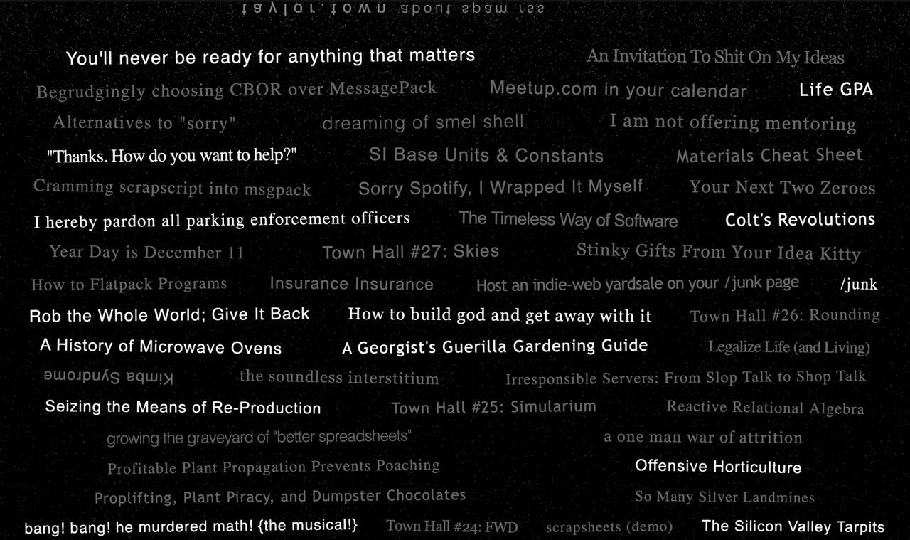
Today, my site looks like this:
Soon it will become something else entirely. Because it’s my website and I’m perpetually becoming somebody else.
You’ll change too. Your passions and values will pollinate; your ugly thing – whatever it is – will come alive again and again.
Taylor Troesh is mayor of taylor.town, author of scrapscript, and connoisseur of crap.