Seen this? It (and the update to it) have been all the rage lately, among “AI forecasters”, on social media, and it has even made it into mainstream media like the Financial Times.
Some of it makes sense, and some if it doesn’t.
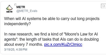
The first version dropped on March 19, METR (Model Evaluation and Threat Research — a non-profit research lab that was created in December 2023) — published a report on a study they had done, measuring the ability of large language models to carry out software-related task. They also tweeted the following:

The tweet took off, and then on April16, OpenAI released its new models o3 and o4-mini. METR carried out their tests on these models, added them to the graph, and found that “AI” was improving even faster than it had reported in March.
Extrapolating from neatly drawn graphs, people are tweeting things like, “Within 12 months, AI will do a reasonable job on most >1hr messiest cognitive tasks” – a claim that in our view doesn’t even pass the “circle the r’s in Strawberry” sniff test.
§
Some of the work that went into the METR graph is actually terrific, carried out with exemplary care, adhering scrupulously to best practices. The technical report was, for the most part, responsibly written, carefully describing the scope of the findings and giving suitable, appropriate warnings about potential gaps.
METR’s blog and its tweets (perhaps written by publicists or by generative AI rather than by scientists), however, dropped the careful qualifications and nuance of the technical paper and made claims that go far beyond anything that the study actually supports. These were further amplified in the Twitter echo chamber.
Alas, the whole thing was based on a flawed premise.
§
Everything started with good intentions. The scientists at METR set themselves the task of studying how the performance of large language on software-oriented tasks has improved over time – certainly an important question. They put together a collection of 107 problems related to programming and software engineering. The problem collection was constructed with admirable care; they were proposed, vetted, and edited by experts in a multicycle, laborious process. Most of the problems in the datasets are unpublished, to prevent their being used for training future models. However, METR has published some examples on their github site, and judging by those, they have created a diverse collection of interesting, often challenging, problems of high quality. Here, for instance, is the summary of one:
The task is to implement functions to process payments and avoid duplicate transactions when they are coming in asynchronously from different time zones and currencies. Two payments have to be matched based on fuzzy rules such as time difference across time zones and multi step currency conversions.
There are many edge cases and tricky details to get right, and the most difficult version ("full") involves setting up all rules related to handling timezones.
The complete problem specification is 3000 words long – well worth looking at to get a sense of what is really involved in a moderately complex software engineering undertaking.
To make a quantitative analysis of their study, METR needed to have a quantitative measure of the difficulty of the problems that a model can address – the y-axis on the graphs at the start of the article.
That’s where things started to get weird. First, they decided to characterize the difficulty of each problem in terms of the time that a human expert takes to solve it; for instance, it is recorded in the dataset that human experts take an average of 23 hours 37 minutes to write the payment processing code. Then they decided to measure the quality of an AI system in terms of the time-demands of problems that the system gets 50% correct. For instance, according to the graph, GPT-4 scores 50% correct on problems that people take 4 minutes to solve. So the y-axis value for GPT-4 is 4 minutes.
This combination of duration and accuracy leads to a very weird and arbitrary measure. For instance: The first graph says that the task “question answering” takes 15 seconds; “count words in passage” takes 2 minutes, and “find fact on web” takes 11 minutes. Presumably, METR doesn’t mean that these tasks in general take that long; those are the average human times for the particular instances of those tasks in the dataset. However, if we consider these tasks in general, then the time for humans to carry them out depends on a zillion different factors. The time that people take to count words in their native language depends almost purely on the length of the passage. If they are asked to count words written in an alphabet with unfamiliar conventions for word breaks, it takes much longer. The time that people take to answer a question depends on all kinds of things; how long is the question, how complex is the reasoning process needed to solve the question, how well do the people know the subject matter, how experienced are they in answering this particular kind of question, what resources or tools do they have access to, and so on. It is not credible that the 50% success rate tracks these combinations of factors with any precision. In other words, the 4-minute mark for GPT-4 is completely arbitrary; you could probably put together one reasonable collection of word counting and question answering tasks with average human time of 30 seconds and another collection with an average human time of 20 minutes where GPT-4 would hit 50% accuracy on each. And it would be absurd to say that o3 can do all tasks that humans can do in 1.7 hours or that GPT-3 could do anything that a person can do in 15 seconds
Bluntly, the Y-axis simply doesn’t make much sense. And needless to say, if the Y-axis doesn’t make sense, you can’t meaningfully use the graph to make predictions. Computers can answer some questions reliably now, for example, and some not, and the graph tells us nothing about which is which or when any specific question will be solved. Or consider songwriting; Dylan wrote some in an afternoon; Leonard Cohen took half a decade on and off to write Hallelujah. Should we average the two figures? Should we sample Dylan songs more heavily because he wrote more of them? Where should songwriting go on the figure? The whole thing strikes us as absurd.
Finally, the only thing METR looked at was “software tasks”. Software might be very different from other domains, in which case the graph (even it did make sense) might not apply. In the technical paper, the authors actually get this right: they discuss carefully the possibility that the tasks used for testing might not be representative of real-world software engineering tasks. They certainly don't claim that the findings of the paper apply to tasks in general. But the social media posts make that unwarranted leap.
That giant leap seems especially unwarranted given that there has likely been a lot of recent data augmentation directed towards software benchmarks in particular (where this is feasible). In other domains where direct, verifiable augmentation is less feasible, results might be quite different. (Witness the failed letter ‘r’ labeling task depicted above.) Unfortunately, literally none of the tweets we saw even considered the possibility that a problematic graph specific to software tasks might not generalize to literally all other aspects of cognition.
We can only shake our heads.
§
The datasets of software-engineering problems that METR has created are potentially very valuable. Some of the qualitative discussions of the limitations of the current technology on these problems is interesting. The paper is worth reading.
But attempting to use the graph to make predictions about the capacities of future AI is misguided, and the fact that it went viral is a sign that in AI (as in so many other domains) people are repeating things that they want to believe, based on their alleged conclusions rather than their validity.
Gary Marcus and Ernest Davis miss the days in which peer review was taken seriously.