After collecting data, we need to design a classifier that works on that data. This means evaluating candidate features. Doing so isn’t expensive in money, but in cpu time. Evaluating features, in the most powerful sense, means training the classifier on all subsets of candidate features and seeing which performs best. That’s unreasonable, as even with only 15 candidate features, it requires training over 30,000 different classifiers, which need to be trained five ways each for cross-validation to boot.
What I ended up doing was guiding the feature selection by the accuracy of classifiers as trained on individual features, for different discrimination tasks. In other words, I had a script that checked “does character frequencies discriminate better between robots and humans than word lengths?” and then repeated that for comparisons between different features, and different classes.4 Different classes means the question is asked not just for robots-vs.-humans but also Claude-vs.-Grok, and GPT-vs.-Gemini, etc.
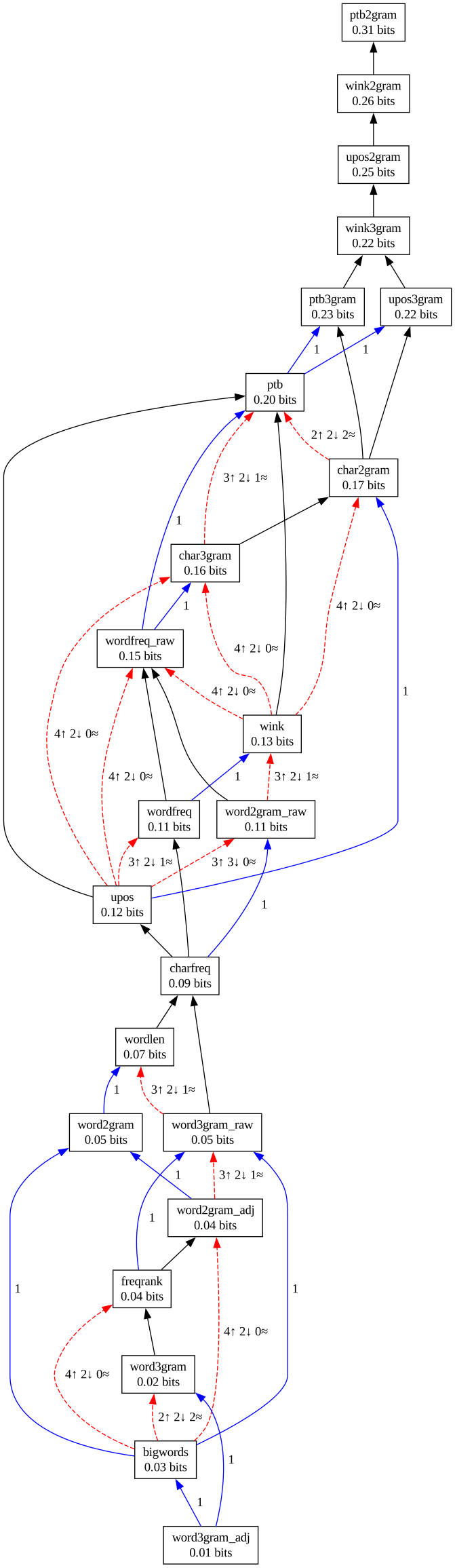
Each of the class pair comparisons produced a list of feature rankings. These lists mostly agreed on the order of features, but there were some disagreements. The ranking of features by power, and the strength of disagreement around relative rankings, is rendered in the graph below.

I think the graph reads quite intuitively, but just to be sure:
- A black arrow means all comparisons agreed on the relative strength of the two features connected with the arrow.5 I suppose technically it means that if a comparison didn’t agree, at least it didn’t disagree. In other words, if four comparisons indicate that feature A and B have roughly the same power, but a fifth comparison indicates feature A is better than feature B, then the graph will show a black arrow from B to A despite the lukewarm response from four out of five comparisons.
- A blue arrow means at least two comparisons agreed on the relative strength of the two features connected with the arrow, and only one comparison disagreed.
- A red arrow means more disagreement (and the exact numbers are shown in the arrow label), but the arrow still points in the direction of the dominant opinion.
Each feature box also has an information quantity expressed in bits. That shows how much that feature helps, on average, in distinguishing between two classes.
Not only is this graph extremely fun to look at – it is also very informative! The feature names may be nonsensical, so we’ll have a brief description of each. As the running example, I will use the following excerpt from a Donald Trump speech:
markets are at their highest point in many years but we can actually say of all time
and a similar random excerpt from an article in the Economist:
the oecd member countries that have taken part in every edition of pisa reached a peak around
Here are the features:
bigwords: the fraction of words longer than 5 letters in the comment. Classic stylistic marker for fancy language, but very weak for discrimination other than in obvious cases.The Trump snippet has a
bigwordsvalue of 18 %, whereas the Economist article is at 29 %.wordlen: replace each word with a number indicating how long that word is, then count frequencies. This is similar tobigwordsbut captures the full distribution.Trump has 30 % words of three letters, 24 % words of two letters, 15 % each of words of 4–7 letters, and 6 % words longer than that. The Economist has a wider spread, with the most common length (35 %) being four letters, then very equal fractions in the span 2–7 letters, and 5 % each for nine letters and a single letter.
freqrank: replace each word with a digit based on how common that word is. The most common word gets the number 0, the ten most common words after that get the number 1, the hundred most common words after that get the number 2, etc. Then count the frequencies of these numbers.Trump uses mostly rank-2 and rank-3 words at frequencies of 50 % and 30 % respectively. This corresponds to the top-100 and top-1000 most common words. The Economist snippet contains very few rank-2 words (though more rank-1 words!) and pulls in plenty of rank-3 and rank-4 words, again indicating more complex vocabulary than Trump.
wordfreq: count the frequency of a small set of function words. It sees how many times a text includes content-less words like “the”, “in”, “many”, “all”, etc.The Trump example never repeats any function words, but this feature would anyway report single occurrences of words “are”, “at”, “their”, “in”, “many”, “but”, “we”, “can”, “of”, “all”. The Economist article has a different set: “the”, “that”, “have”, “part”, “in”, “every”, “of”, “a”, “around”. With these short snippets, this doesn’t tell us much, but with more data it can start to distinguish sources of text.
word2gram: counts bigrams of function words with other words filtered out. This produces strange bigrams that were never in the original text, but it remains a popular way to analyse how people write.The Trump example would have, among other bigrams, “are at”, “at their”, “their in”, “in many”, “many but”, etc. The Economist would have “the that”, “that have”, “have part”, “part in”, etc.
word2gram_adj: counts bigrams of function words only when they are actually found next to each other in the text, i.e. not with other words filtered out. This seems like a more natural way to analyse writing because it only results in bigrams that actually existed in the original text, but as we can tell from the graph, it is a weaker indicator than the regularword2gram.The Trump example would have “are at”, “at their”, but then a jump to “in many”, then another jump to “but we”, “we can”, etc. The Economist reduces to “that have”, “part in”, and “in every”. We see that the Economist has fewer strings of function words.
word3gramandword3gram_adjis like the previous two except for trigrams.The Trump example has two values for
word3gram_adj, namely “are at their” and “but we can”. The Economist has only one: “part in every”.charfreq: count the frequency of each character in the comment. This can be a strong signal if sources have different tendencies to use symbols.Since both Trump and the Economist use English and the fragments I selected have an equal number of words, their character frequencies are actually very similar.
char2gramandchar3gram: count the frequencies of bigrams and trigrams of characters in the comment. This starts to tell us something about styles of punctuation and word choice.Since neither Trump nor the Economist used any punctuation in these snippets, we can only look at letter frequencies, and in these examples, we can tell Trump starts words with the letter “a” more often than the Economist, based on the bigram space-followed-by-a. In contrast, the Economist ends words with the letter “n” more often than Trump.
wordfreq_raw: Count frequencies of words, but not limited to function words. The benefit of this is that if there are some words strongly preferred by a source6 And they haven’t heeded their editor’s device to kill their darlings. like “mediated” that wouldn’t be in any function word list, but with raw word frequencies the classifier can learn to distinguish on that word anyway.However, this is also a dangerous feature because it can train the classifier to pick up on subject matter differences. For example, in the Economist case it could learn that if the text contains the abbreviation “oecd”, it is from the Economist, but if it contains the word “actually” it is from Donald Trump.7 Okay, that might not be a bad rule, but you can see how it could lead to unintentional consequences in other cases!
Recall, however, that we took pains to construct a balanced dataset for the code comment classifier. This is where that pays off. There is very little subject matter leakage in the raw word frequency feature, and instead it does pick up on actual stylistic quirks.
word2gram_raw,word3gram_raw: take the frequencies of bigrams and trigrams of words, with no filtering for function words.wink,upos,ptb: convert each word to a part-of-speech (pos) tag indicating its grammatical role, and then count the frequencies of those pos tags. The reason this is a strong signal is that it captures the way different sources phrase themselves, without getting distracted by choices of words.The three variants of this feature use different engines for pos tagging8 Some engines are more accurate than others., but they all produce roughly the same result. The benefit of the
wink-nlpengine is that – even though it’s weaker than the other two in the graph – it runs in the browser.The pos tag replacement turns the Trump speech into something like the sequence
NNS VBP IN PRP$ JJS NN IN JJ NNS CC PRP MD RB VB IN DT NN. This sequence contains more plural nouns (NNS) than the Economist, which on the other hand contains more proper nouns (NNP) and determiners (DT).wink2gram,upos2gram,ptb2gram,wink3gram,upos3gram,ptb3gramare bigram and trigram variants of the above.
When evaluating classifiers with a single feature at a time, which is what the graph above represents, we can see that pos tag n-grams are very powerful regardless of which tagging engine is used. Character n-grams are also powerful, and raw word frequencies are not so bad either.
But single features are only half the story, because when we train classifiers on multiple features, the features interact. Interaction makes some features redundant, but it can also make combinations of features stronger than they were individually! I started with the set of top-scoring single features, and systematically evaluated combinations of features by adding and removing individual features to see how they influenced each other, but eventually I got tired of that exercise and picked a set of features for the production classifier rather arbitrarily.9 I also had a few subcommands to the training script that let me explore features and how their associated frequencies varied among the classes to be dicriminated.