
Twice this week, I have come across embarassingly bad data.
The first instance is the UK government’s fuel finder data. This is a downloadable CSV file of fuel station locations and prices from around the UK. A potentially very useful database, especially during the current conflict in the Middle East. A customer suggested it as a possible practice dataset for my data wrangling and visualization software, Easy Data Transform . So I had a quick look and spotted some glaring errors within a few minutes.
A quick plot of the latitude and longitude shows some clear outliners:
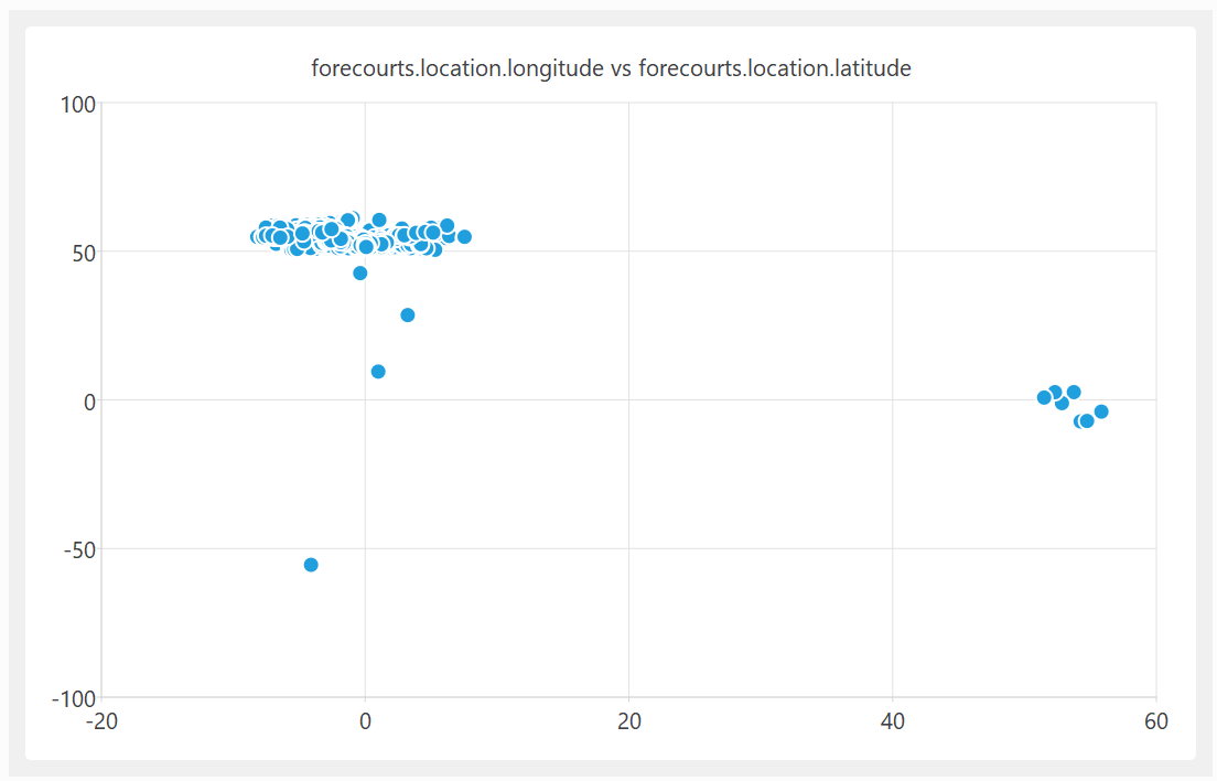
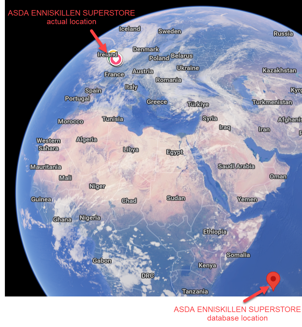
On further investigation, some of these UK fuel stations are apparently located in the Indian and South Atlantic oceans. In at least one case, it looks like they got the latitude and longitude the wrong way around.
A quick look at the fuel price columns also shows some major issues:
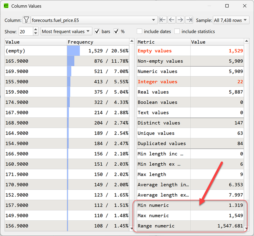
The ratio between the most expensive and cheapest fuel (per litre) is 1538:1. Clearly wrong.
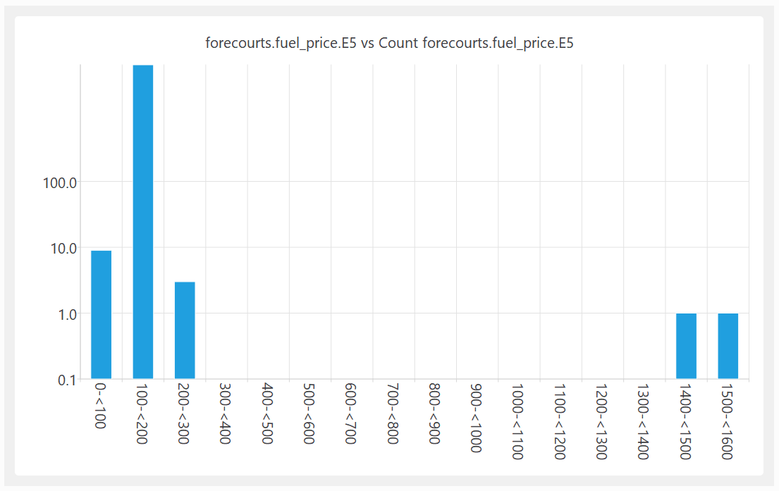
Shown as a histogram with a logarithmic Y axis:
I am guessing that the reason for this bad data is that the fuel stations are submitting their own data and, humans being humans, they make mistakes. But then the government is publishing the data without even the most basic checks. That just isn’t good enough.
I reported the problem on 22-Mar-2026. They acknowledge my email on 24-Mar-2026 (“Thank you for sharing this, we have passed this on to the technical team to have a look at.”). The CSV file published on 29-Mar-2026 still has the garbage data.
The second instance is a report on electric cars from UK motoring organization, the RAC. The first graph in the article is this:
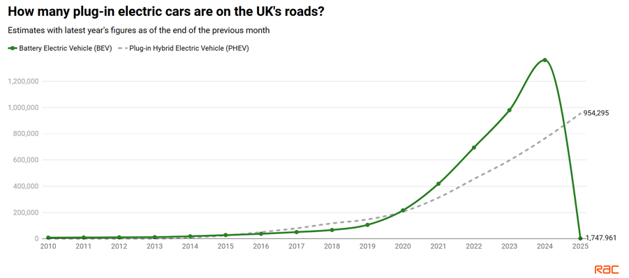
Did the number of Battery Electric Vehicles on the UK’s roads suddeny drop from ~1.4 million in 2024 to ~0.0017 million in 2025? What happened to those ~1.4 million vehicles? I’m guessing that someone got their thousands and millions mixed up. But then they published the report with this glaring error. Did anyone mathematically literate even check this graph?
Lousy data undermines trust in institutions and can lead to bad decisions. I fear we are heading for a future where LLMs generate data, which people don’t bother to properly check. This data is then used train LLMs. The error is then much harder to spot once it is served back without the original source by LLMs. A slop-apocalypse.
Authors should have their work proof read, programmers should test their code and data people should do basic data validation. Let’s take some pride in our work.